Cameron Iizuka ’22, considers the word Chromophobia and its impact in the art world.
When we first entered the High Museum, I was under the impression that it would be a Black museum, centering work either from modern artists, Civil Rights-era artists, or simply work about the African diaspora. When, however, we approached an austere, all-white building, and entered to find an alien world of white plaster and gaping windows, I realized it was anything but the sort.
You see, within the art world (in particular, the anti-imperialist, anti-colonialism world), there’s a theory known as “chromophobia” which refers literally to the “fear of color.” Beyond being a physical condition, there’s political implications behind it, as it appears routinely in artwork.
In “Western” artwork, there’s predominant emphasis on aesthetics that lack color (ex. marble statues). Or, if there is color, it’s contained and limited. That’s not to say color has no welcome space, realistic and impressionist landscapes and portraits often use pigment to display “lifelike” scenes of the pastoral or the banal. Similarly, in the home there is an emphasis on “clean” design. Either neutral tones like beige or brown or tonal contrast with white and black. Perhaps there can even be a “splash” of taxi-cab yellow or Tiffany Blue. Either way, the color is limited, isolated, and contained.
These works exist in direct opposition to the bright, dynamic, and ornate designs that come from “Eastern” or even Indigenous artwork. Especially in such cultures, there’s less division or separation between what should exist solely as “art” and what can still be beautiful, as well as functional. Clothing, bowls, rugs, dishware, buildings, and more feature styles, designs, and patterns of that particular culture. They use history and stories from oral tradition to retell that same past, communicating a message beyond the purpose of the item or its aesthetic value.
Chromophobia, therefore, is not just the fear and subsequent erasure of color, but also a stripping of ancestry, folktale, and legend. So too does its existence and deference in the art community necessitate the erasure of a people through cultural genocide. Its pervasiveness has given way to another layer of “respectability politics” in the art world, demanding artists who want to include color, flavor, or culture in their pieces to do it “on their terms” in order to be respected as real artists. In a more abstract capacity, so too can chromophobia mean “whitewashing,” whether by viewing “foreign” people through a particular lens of “otherizing” (ex. Orientalism), “assimilation,” or simply erasure.
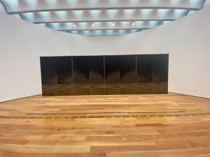
With all of this in mind, it was slightly disheartening to see the building’s architecture reflected that, as every wall was bone white and the first three floors were all “classics.” There were marble statues, glassware, muddied-gray paintings of landscapes long-since bulldozed and turned into shopping centers… It was much of nothing new.
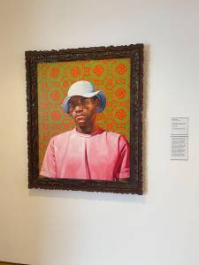
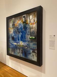
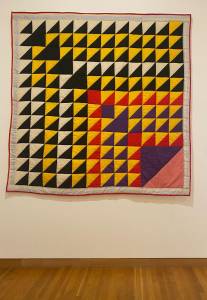
That is, until I got to the fourth floor where there included works from the African diaspora, the Civil Rights-era, as well as postmodern portraitists, abstract painters, and sculptors (aka all of the things I was hoping to see throughout the museum!). Artists such as Teresita Fernandez (“Nishijin Sky”), Kehinde Wiley (“Thiogo Oliveira do Rosario Rozendo”), Mark Yang (“Fall”), Jaime Hayon (“FUNKIO” & “Green Chicken”), Radcliffe Bailey (“En Route”), and Lucy T. Pettway (“Birds in the Air”) were featured prominently for various beauty and messaging: their reclaiming of Black iconography, history, and identity, explorations and detailed autopsies of colonialism, childlike dreams, and portrayals of queerness and intimacy through a lens of Modernism.
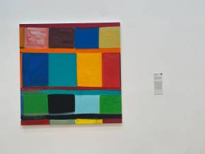
The Mondrian-esque square painting Indian Country by Stanley Whitney, in particular, felt important to highlight given the ways in which it directly fights chromophobia. The dripping paint, the uneven brushstrokes, the uneven borders and messy-thick lines… it’s imperfect. But that’s why it’s beautiful. Oh the wabisabi-ness of it all! The plaque besides the painting only adds to the piece’s limitless expansion upon all these swirling ideas:
Taking inspiration from Color Field painting of the 1960s, Minimalism, and the jazz improvisation of Ornette Coleman, Stanley Whitney constructs his painterly grids of color by way of a “call and response,” in which one color suggests the next.
While our group wasn’t initially planning to even go to the High Museum, it was a resonant experience nevertheless to find examples of the lasting legacies of colonialism within artistic spaces, and serve as a reminder of what we can strive for, whether in our art, our form, our life, and/or our stories.